Info
Origin
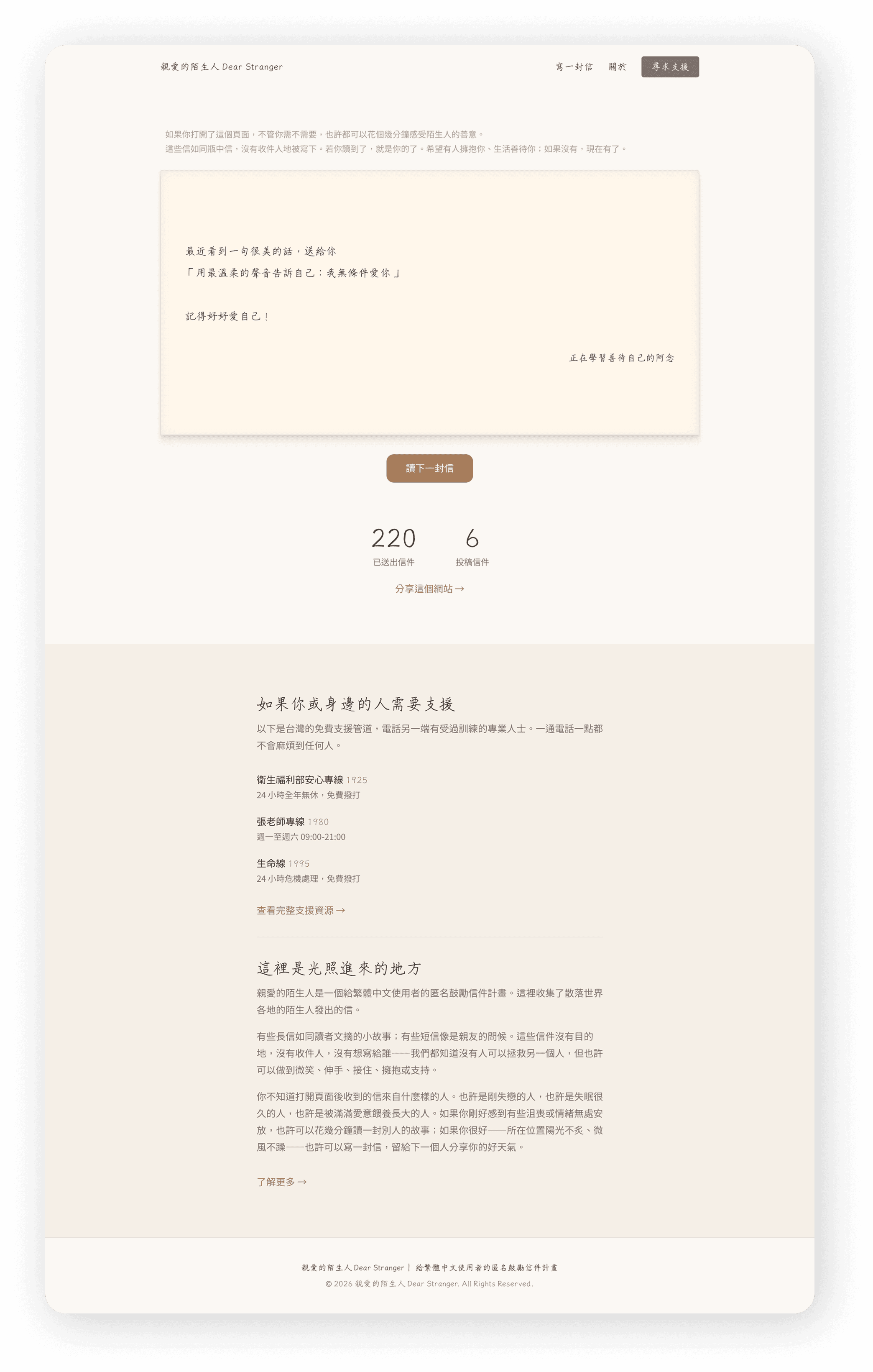
The Core Design Principle: Make Receiving Easy First
Outcome
Design Challenge
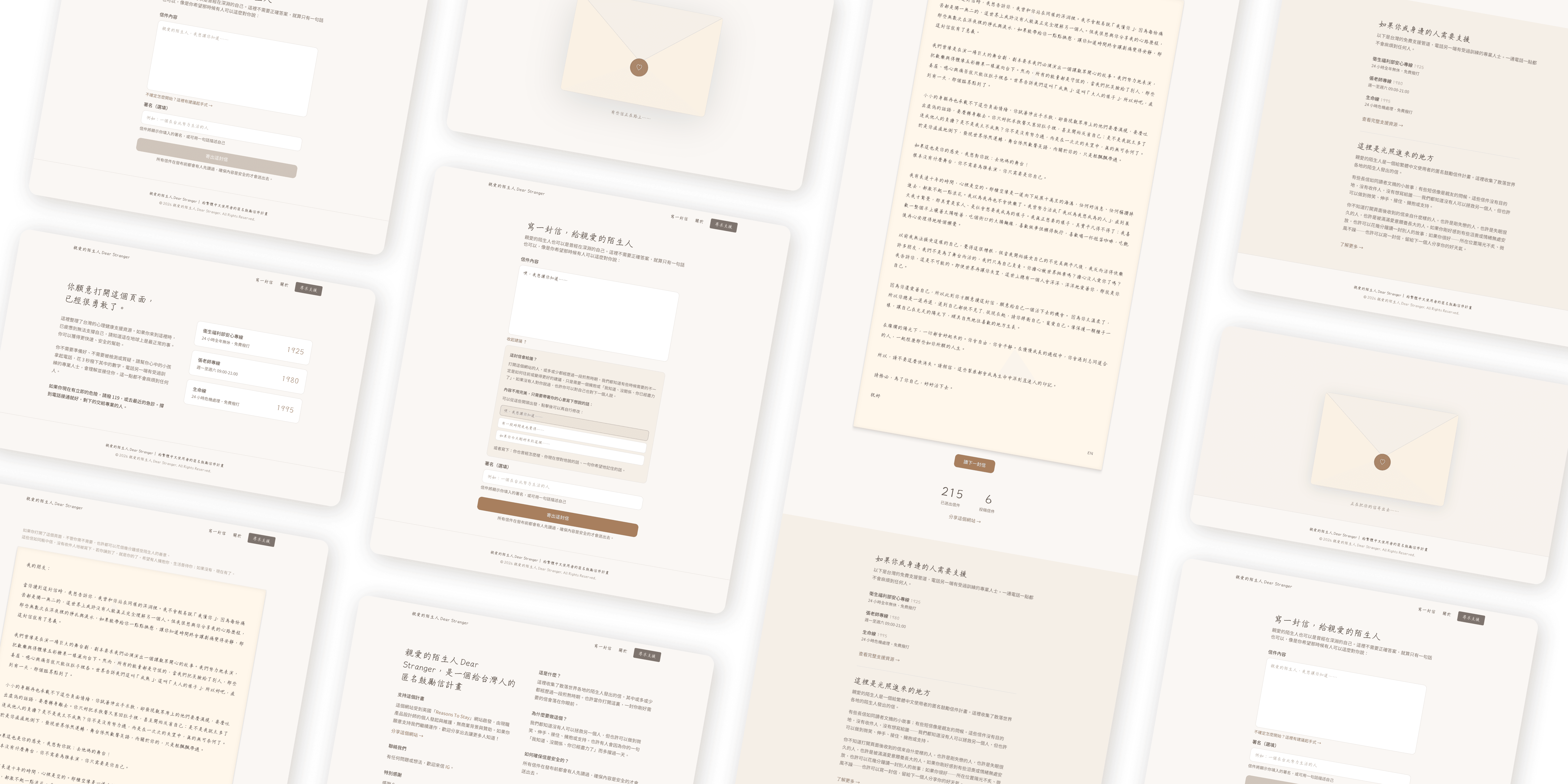
1. Framing and tone
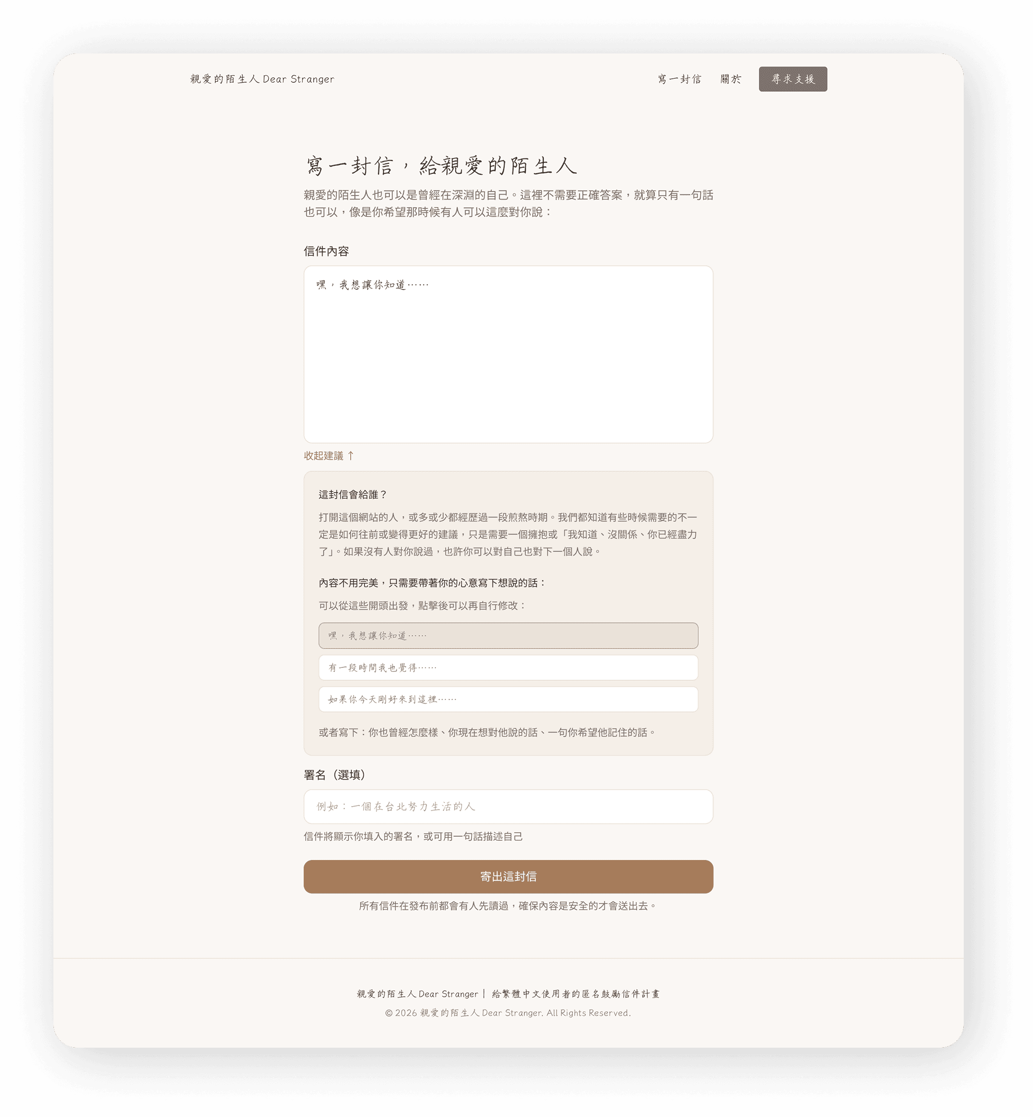
Before the writing field even appears, I wrote copy that reframes the act of writing. You're not being asked to say something profound. You're just being asked to say something true. The language is warm, low-pressure, and honest about what this is.
2. Suggested openers (建議起手式)
This was the feature I was most unsure about — and the one that ended up mattering most. I created a set of one-line prompts that users can tap to pre-fill the beginning of their letter. Things like starting with who the letter is for, or a single opening line that gets the cursor moving.
The key decision: tapping a prompt doesn't lock you in. It populates the field, and you can edit, delete, or ignore it entirely. The goal is just to break the paralysis of the blank page.
3. No word count limit
Some letters are two sentences. Some are two pages. I didn't want anyone to feel like they were doing it wrong.
# 2: Zero-Budget Technical Decisions
No paid database → Used a lightweight, free-tier solution for letter storage and moderation
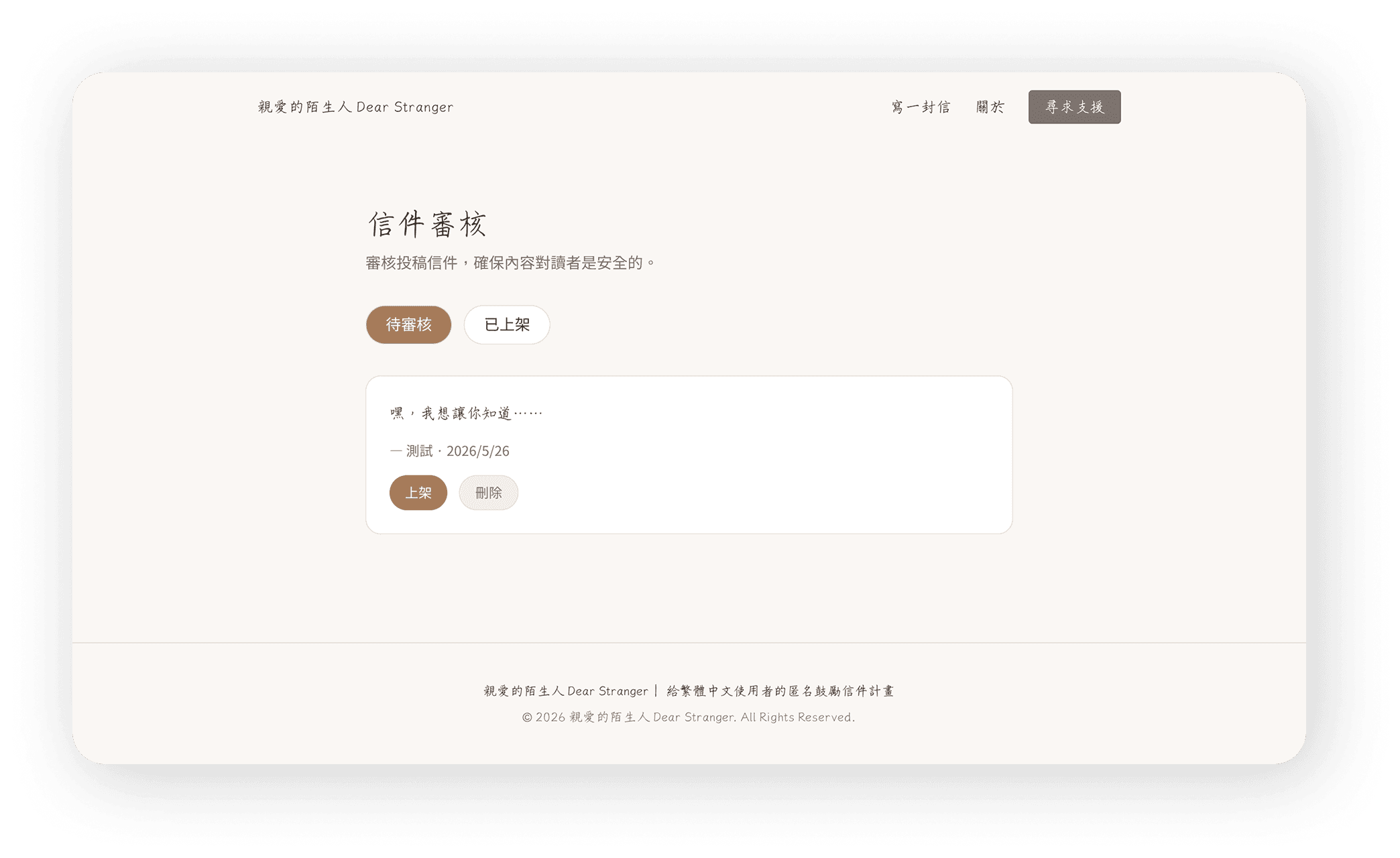
No backend team → I review and approve letters manually from an admin interface
No paid hosting→ Deployed on free-tier infrastructure
No design handoff → I designed and implemented directly, collapsing the gap between intention and execution
I don't write code. I can read basic HTML and CSS, but I've never built a production web app from scratch.
What I did instead: I used Claude code as my development partner. I described what I wanted in plain language. It wrote the code. I learned enough to review it, ask the right follow-up questions, and iterate.
This process taught me something I didn't expect: when you're the designer and the builder, you make fewer decisions that are impossible to implement. The constraints become creative inputs, not blockers.
Visual Direction: Warm, Legible, Layered
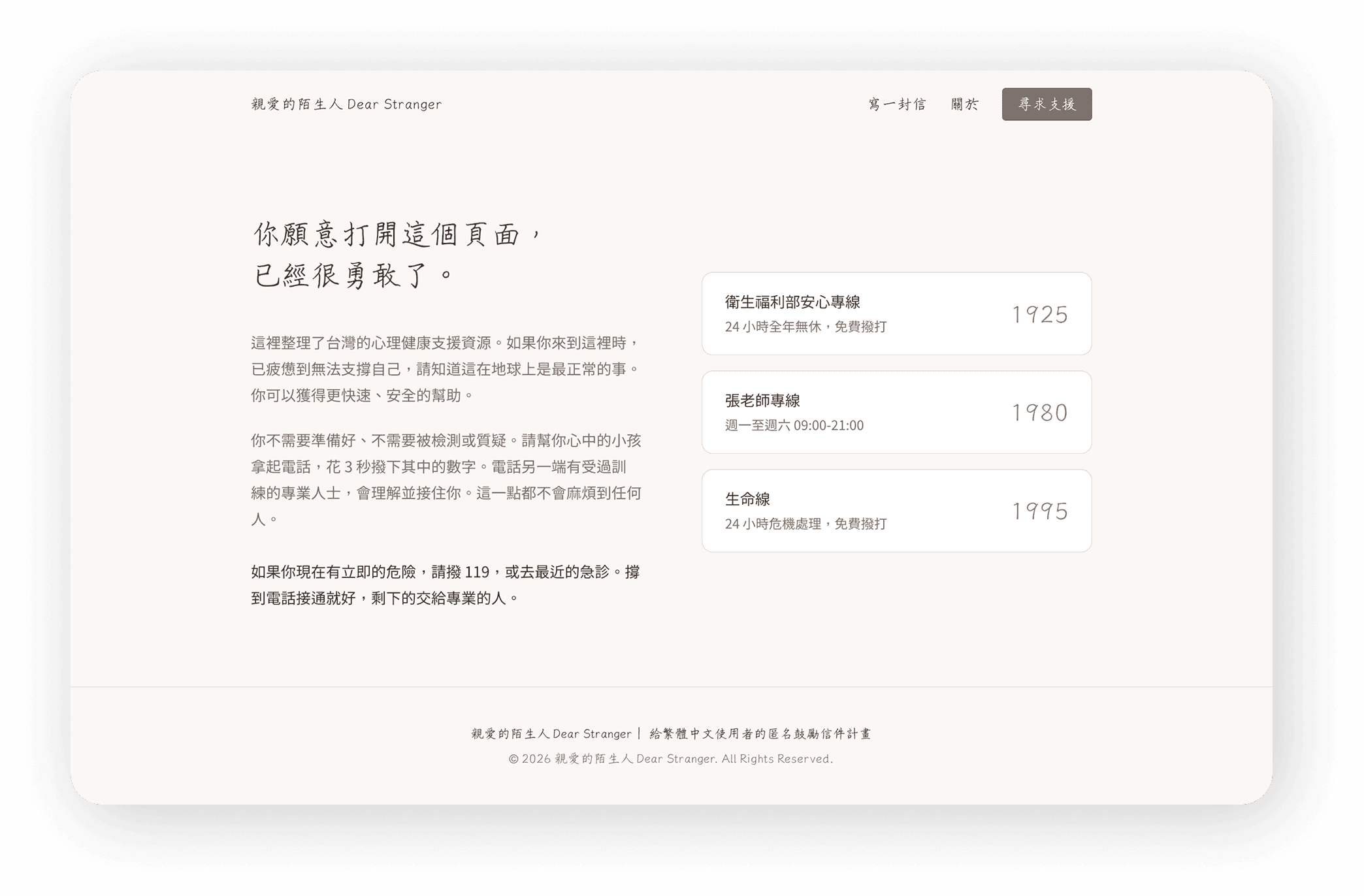
The visual language was intentional from the start.
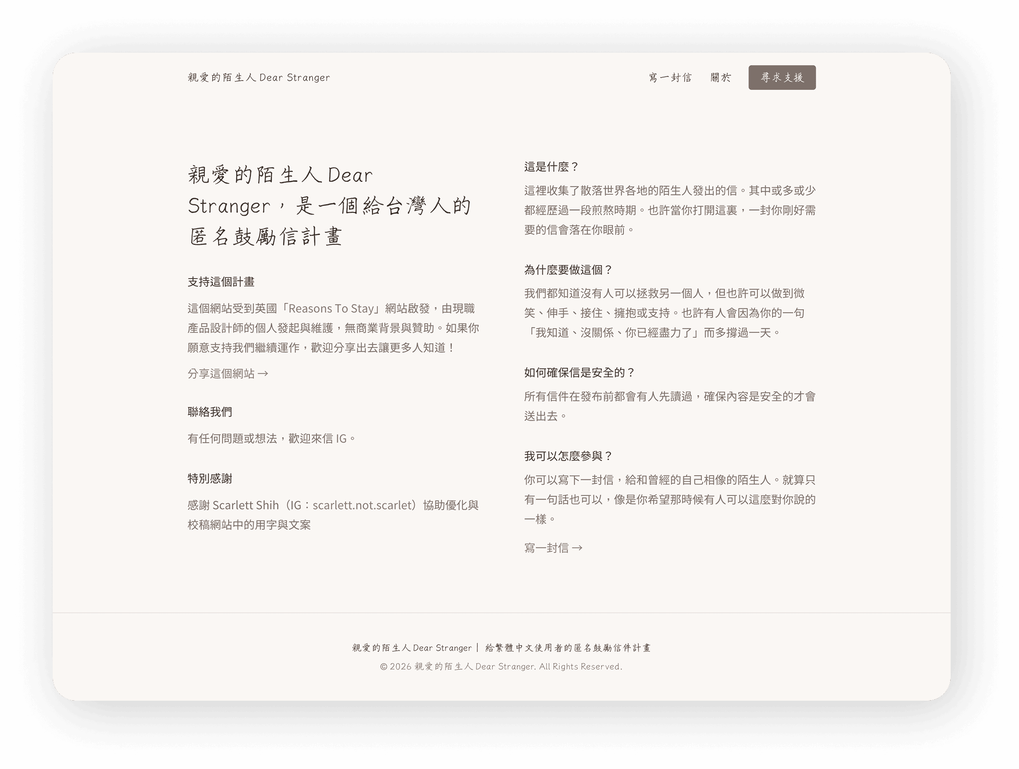
Warmth and sincerity were the brief I gave myself. This wasn't a productivity tool or a social platform — it needed to feel like a handwritten note left on a stranger's doorstep.
Typography: A combination of a clean, highly legible body typeface and a handwriting-style font. The handwritten font adds warmth and texture without sacrificing readability — it appears in moments that feel personal, not as the primary reading font.
Color: Warm, muted tones. Nothing clinical. Nothing loud.
Motion: Restrained, except in one place.
The Detail I'm Most Proud Of: The Send Animation
When you finish writing your letter and press send, something happens on screen before the letter disappears into the world.
I spent a long time on this animation — going back and forth with AI, adjusting timing, easing, the way the letter seems to lift and travel. It needed to feel like a release. Like actually letting something go.
It's a small thing. But I think it's the moment that makes the experience feel complete. You wrote something real. Now it's going somewhere. The animation makes that feel true.
Reflections
Continue Viewing …