Challenge
My Role

User Scenario
Susan notices on the Joinit website that using tokens allows them to purchase the same product at a better price. Since she don’t have any Joinit tokens yet, she decide to buy some first….
The second time she returned to the site to purchase tokens, things didn’t go as smoothly.
When Susan reached the invoice section, she was confused — she clearly remembered saving her preferred mobile barcode number the last time. Why was she being asked to enter it all over again? Feeling slightly annoyed, she wondered, “Do I really have to retype this every time I buy tokens?”

Problem
Solution
Identified User Types
Since the platform allows saving multiple invoice records, we first categorized users based on their invoice settings to ensure the interface supports various user scenarios and remains scalable. We identified three types of users:
Users with no saved default invoice
Users with a default invoice but no additional saved invoices
Users with a default invoice and multiple saved invoice records
Invoice Option Design Strategy
To determine how invoice options should be displayed, we analyzed the different types of invoices and their required fields (as shown in the diagram). Our goal was to help users quickly recognize each option while avoiding overly long content in dropdowns and input fields that could hinder readability and aesthetic consistency.

We then aligned the option structure with user mental models:
Personal invoices: Through secondary research, we identified which subtypes are most frequently used by users. Mobile barcode which is the most common option is preselected by default to streamline the selection process.
Business invoices: According to usability heuristics, interfaces should minimize the user’s memory load. Company names are easier to recognize than tax ID numbers, so displaying the company name in the options list provides a more intuitive experience.
Donation invoices: Based on interviews with users who regularly donate invoices, most can easily recall the five-digit donation code and typically donate to the same one or two organizations. Therefore, displaying the donation code—rather than the full organization name—improves efficiency and speeds up user selection.

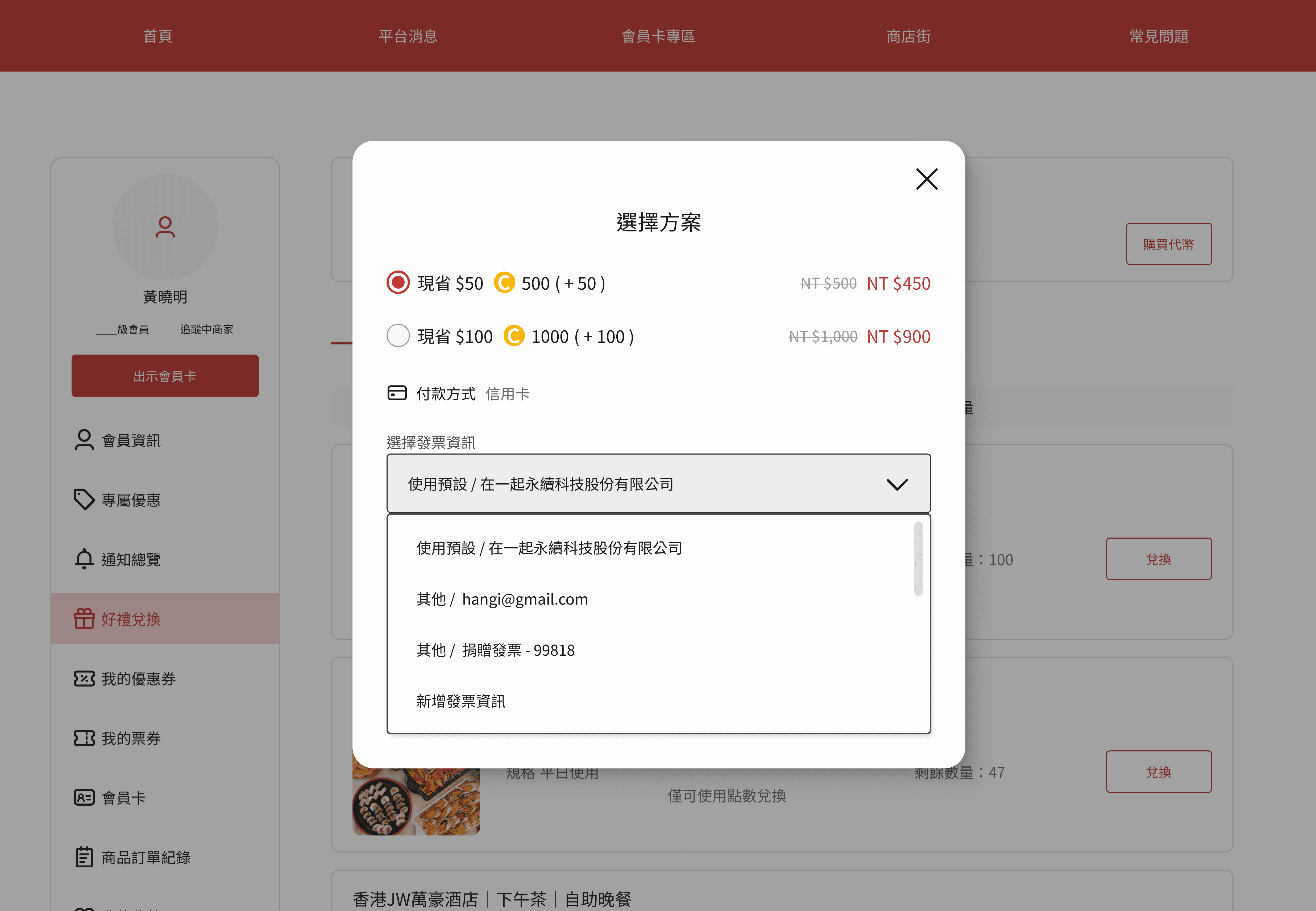
By mapping these user behaviors and mental models, we designed a selection interface that is both visually clean and user-friendly—ultimately enhancing the speed and accuracy of the invoice selection process.
UI Mockups

Reflections
Enhancing Visual Readability: It's crucial to ensure sufficient contrast between text and background, especially when using grayscale tones. Text must remain legible under all circumstances. Using Figma accessibility plugins for contrast checks is a helpful way to maintain accessibility standards.
Optimizing User Flows Based on Real Usage: Designing around the most frequently used invoice type can make the flow more efficient. For example, if most users prefer mobile barcodes for personal invoices, we can prioritize that option in the initial release, and introduce other types like member invoices later on—maximizing both usability and development resources.
Design Begins with Context: Embedding real user scenarios into the design process helps uncover hidden pain points. For instance, overlooking the scenario of returning users could result in repetitive input steps, frustrating the user and increasing the risk of drop-off. Contextual thinking leads to smarter and more empathetic design.