Web Design

Web Design

UI Design

UI Design

Non-profit Cooperation

Non-profit Cooperation

Taiwan Sunlight Seeding Association - CSR Innovation Matching Platform

Taiwan Sunlight Seeding Association - CSR Innovation Matching Platform

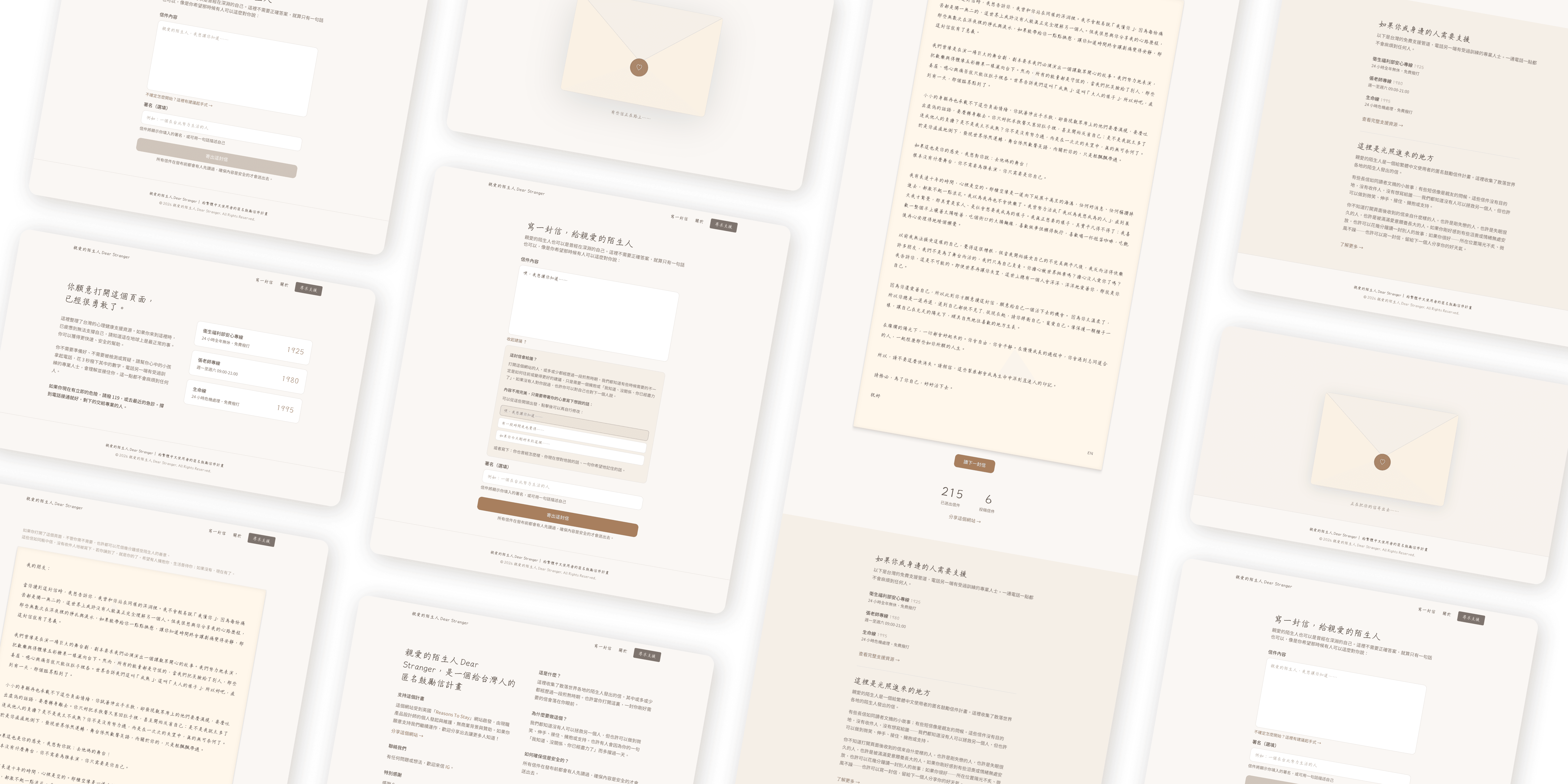
Designed and shipped an anonymous encouragement letter platform entirely independently, using AI tools for development. A side project that turns strangers' words into someone else's lifeline.

Designed and shipped an anonymous encouragement letter platform entirely independently, using AI tools for development. A side project that turns strangers' words into someone else's lifeline.

Taiwan Sunlight Seeding Association

Taiwan Sunlight Seeding Association

Taiwan Sunlight Seeding Association, known as TSSA, is a nonprofit organization established in 2020, aimed at creating an ecosystem of public welfare through a digital sharing platform. By matching schools, businesses, and nonprofit organizations, it allocates resources to the units that need them in the most effective way.

Taiwan Sunlight Seeding Association, known as TSSA, is a nonprofit organization established in 2020, aimed at creating an ecosystem of public welfare through a digital sharing platform. By matching schools, businesses, and nonprofit organizations, it allocates resources to the units that need them in the most effective way.

Project Information

  1. My role: a solo designer, including communication with clients

  2. Duration: 2 months, 2023/06 - 2023/07

  3. Tools: Figma, Wordpress

  1. My role: a solo designer, including communication with clients

  2. Duration: 2 months, 2023/06 - 2023/07

  3. Tools: Figma, Wordpress

Define the user, converting pain points into product usage needs.

Through the explanation from the TSSA colleagues, I learned that the primary users of their website are two groups: corporate units and nonprofit organizations. So, I conducted a brief interview with the TSSA colleagues and also had an interview with my company's public relations department to understand the user information from the corporate side. This, combined with the use of AI, helped me gain deeper insights into the users. The user pain points I organized and the corresponding product usage needs are as follows:

Through the explanation from the TSSA colleagues, I learned that the primary users of their website are two groups: corporate units and nonprofit organizations. So, I conducted a brief interview with the TSSA colleagues and also had an interview with my company's public relations department to understand the user information from the corporate side. This, combined with the use of AI, helped me gain deeper insights into the users. The user pain points I organized and the corresponding product usage needs are as follows:

The Core Design Principle: Make Receiving Easy First
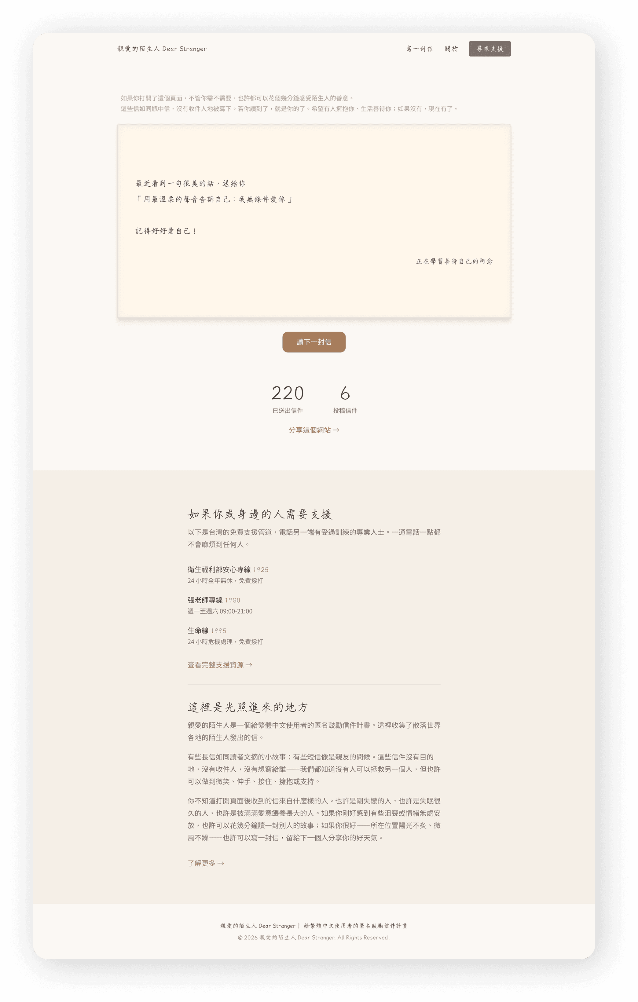
Most platforms like this ask you to engage — to join, to contribute, to write something — before you get anything back. I wanted to flip that. The moment you open Dear Stranger, you receive a letter.

No sign-up. No prompt. No friction. Just a letter, from someone you'll never meet, written for anyone who might need it. If you want another one, you press 「再讀一封」(Read Another). That's it. This wasn't just a UX decision — it was a philosophical one. The whole point of the platform is that you don't have to earn kindness. It's just there.

Most platforms like this ask you to engage — to join, to contribute, to write something — before you get anything back. I wanted to flip that. The moment you open Dear Stranger, you receive a letter.

No sign-up. No prompt. No friction. Just a letter, from someone you'll never meet, written for anyone who might need it. If you want another one, you press 「再讀一封」(Read Another). That's it. This wasn't just a UX decision — it was a philosophical one. The whole point of the platform is that you don't have to earn kindness. It's just there.

User Journey of Gold: Integrating the page into the original website of TSSA
Due to limitations in time and resources, this project needs to be integrated with the TSSA site itself on WordPress. Therefore, I planned the user journey by connecting the pages mentioned above into a path for users to navigate simply and naturally within the website.

This process indicates that when users enter the TSSA website, they browse partner information through the ideal website usage process to contact them. After arriving at the homepage, users can quickly enter the Partners page through the buttons on the navigation bar to browse all the nonprofit organizations and organizations that TSSA helps match; then, they can click to open a modal on the same page to view information about the organization they are interested in without needing to jump to another page; finally, through a button, users are guided to the page to fill out the matching form, allowing them to leave matching information.

Due to limitations in time and resources, this project needs to be integrated with the TSSA site itself on WordPress. Therefore, I planned the user journey by connecting the pages mentioned above into a path for users to navigate simply and naturally within the website.

This process indicates that when users enter the TSSA website, they browse partner information through the ideal website usage process to contact them. After arriving at the homepage, users can quickly enter the Partners page through the buttons on the navigation bar to browse all the nonprofit organizations and organizations that TSSA helps match; then, they can click to open a modal on the same page to view information about the organization they are interested in without needing to jump to another page; finally, through a button, users are guided to the page to fill out the matching form, allowing them to leave matching information.

UI interface and design decisions

# 1: Lowering the Barrier to Writing

Reading is passive. Writing is vulnerable.

Most people who visit a site like this will read and leave. Getting someone to write a letter to a stranger — without knowing who will read it, without any feedback, without a community to belong to — is a much harder ask. I tackled this in three layers:

# 1: Lowering the Barrier to Writing

Reading is passive. Writing is vulnerable.

Most people who visit a site like this will read and leave. Getting someone to write a letter to a stranger — without knowing who will read it, without any feedback, without a community to belong to — is a much harder ask. I tackled this in three layers:

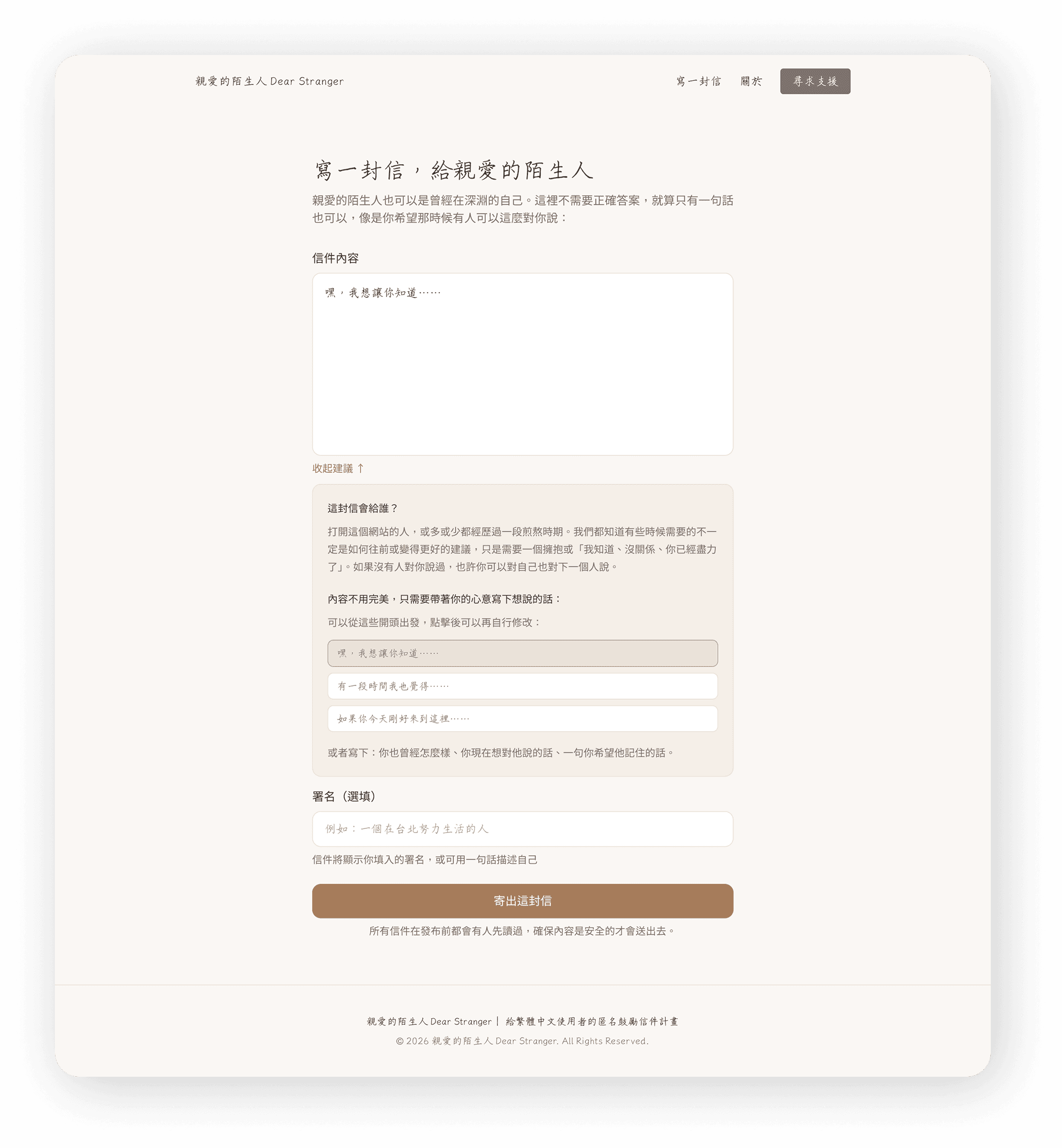
1. Framing and tone

Before the writing field even appears, I wrote copy that reframes the act of writing. You're not being asked to say something profound. You're just being asked to say something true. The language is warm, low-pressure, and honest about what this is.

2. Suggested openers (建議起手式)

This was the feature I was most unsure about — and the one that ended up mattering most. I created a set of one-line prompts that users can tap to pre-fill the beginning of their letter. Things like starting with who the letter is for, or a single opening line that gets the cursor moving.

The key decision: tapping a prompt doesn't lock you in. It populates the field, and you can edit, delete, or ignore it entirely. The goal is just to break the paralysis of the blank page.

3. No word count limit

Some letters are two sentences. Some are two pages. I didn't want anyone to feel like they were doing it wrong.

# 2: Zero-Budget Technical Decisions

  • No paid database → Used a lightweight, free-tier solution for letter storage and moderation

  • No backend team → I review and approve letters manually from an admin interface

  • No paid hosting→ Deployed on free-tier infrastructure

  • No design handoff → I designed and implemented directly, collapsing the gap between intention and execution
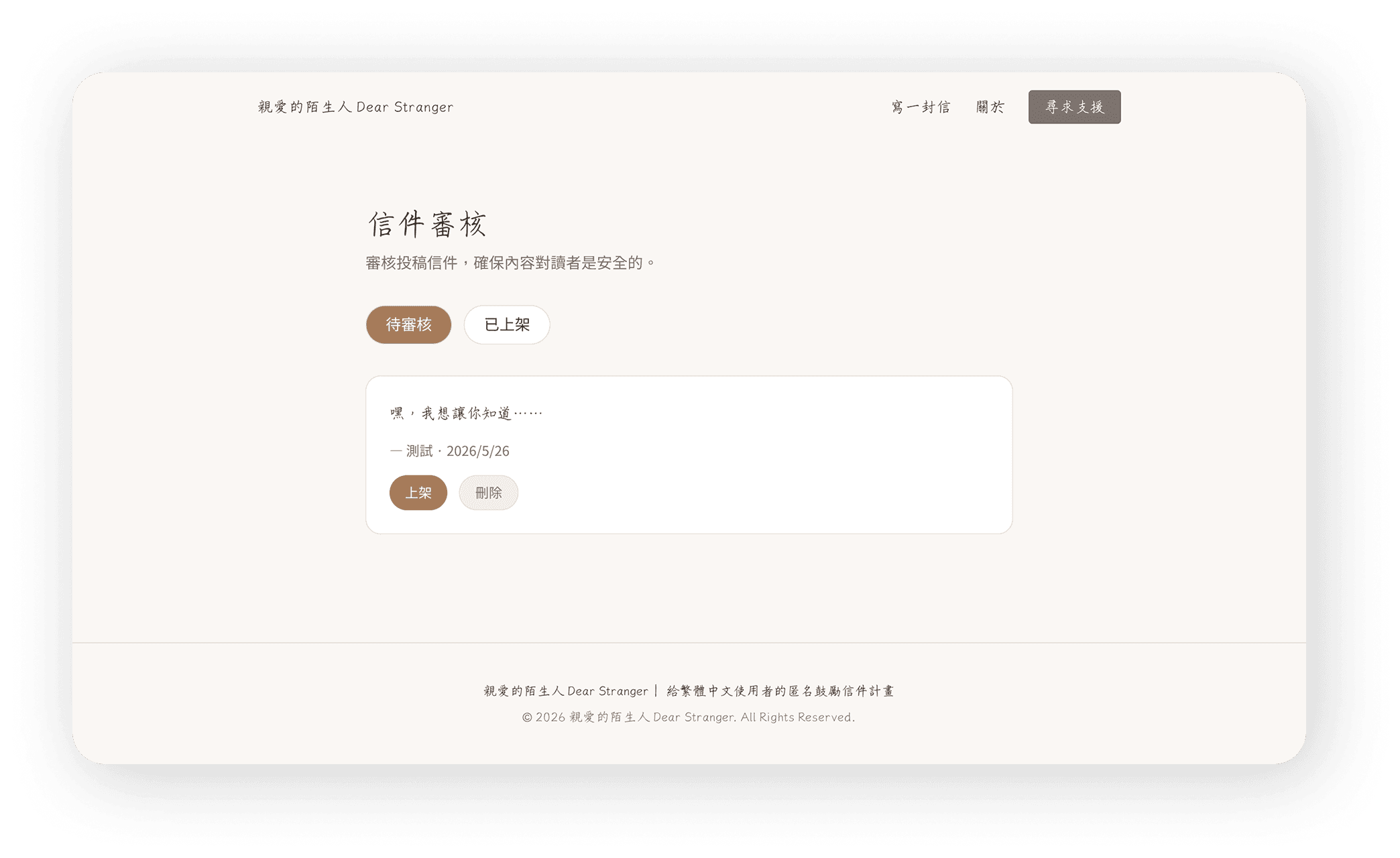
I don't write code. I can read basic HTML and CSS, but I've never built a production web app from scratch.

What I did instead: I used Claude code as my development partner. I described what I wanted in plain language. It wrote the code. I learned enough to review it, ask the right follow-up questions, and iterate.

This process taught me something I didn't expect: when you're the designer and the builder, you make fewer decisions that are impossible to implement. The constraints become creative inputs, not blockers.

Visual Direction: Warm, Legible, Layered
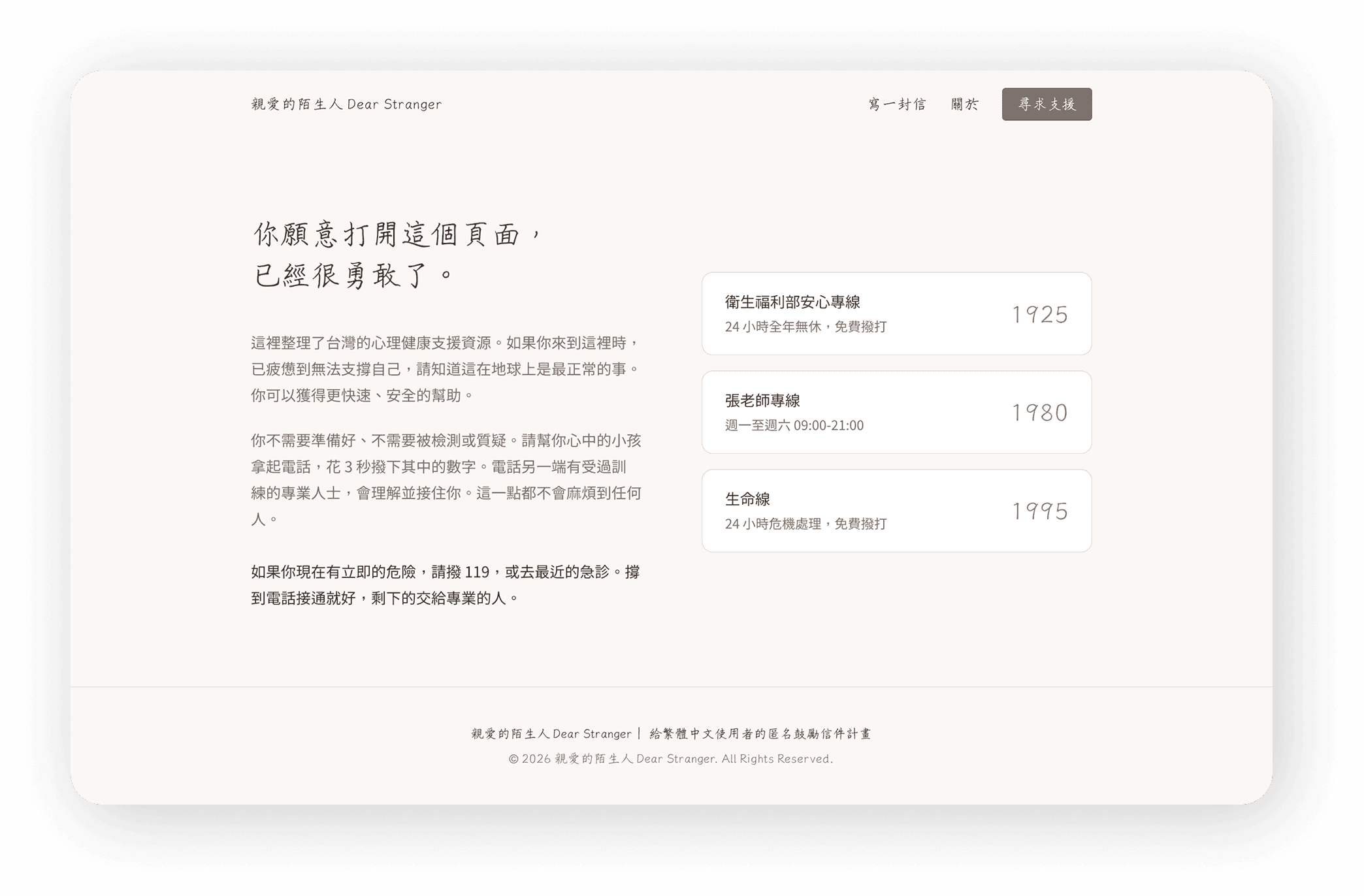
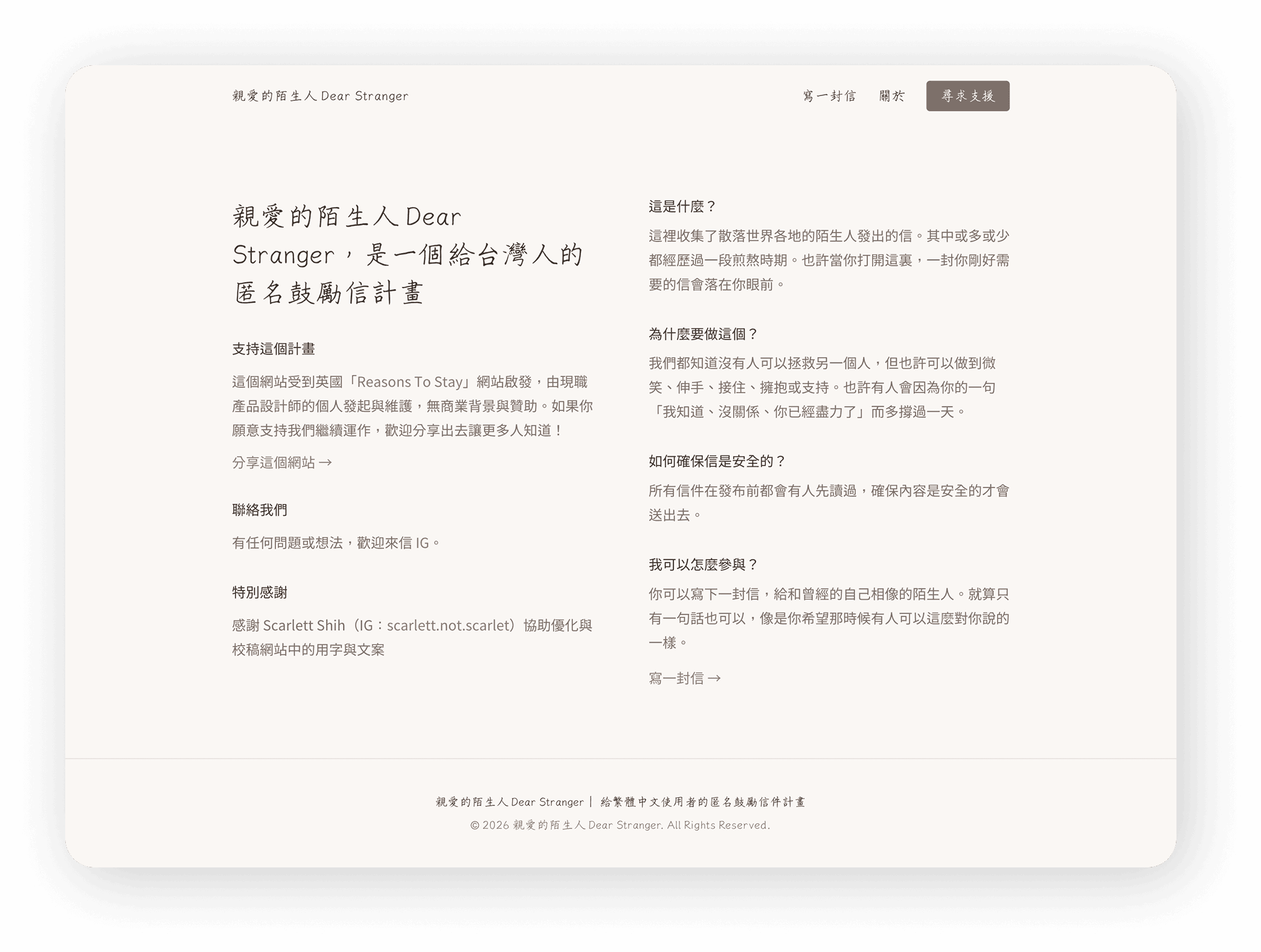
The visual language was intentional from the start.

  • Warmth and sincerity were the brief I gave myself. This wasn't a productivity tool or a social platform — it needed to feel like a handwritten note left on a stranger's doorstep.

  • Typography: A combination of a clean, highly legible body typeface and a handwriting-style font. The handwritten font adds warmth and texture without sacrificing readability — it appears in moments that feel personal, not as the primary reading font.

  • Color: Warm, muted tones. Nothing clinical. Nothing loud.

  • Motion: Restrained, except in one place.

The Detail I'm Most Proud Of: The Send Animation

When you finish writing your letter and press send, something happens on screen before the letter disappears into the world.

I spent a long time on this animation — going back and forth with AI, adjusting timing, easing, the way the letter seems to lift and travel. It needed to feel like a release. Like actually letting something go.

It's a small thing. But I think it's the moment that makes the experience feel complete. You wrote something real. Now it's going somewhere. The animation makes that feel true.

Learning and reflection

Conduct competitive analysis before designing to optimize the matching process.

Conduct competitive analysis before designing to optimize the matching process.

Conduct competitive analysis before designing to optimize the matching process.

As this project is designed according to the specific needs of the client, no user research has been conducted; if a matching process analysis of competing products in the market can be done before the design, it may align better with market trends and the actual needs of users.

As this project is designed according to the specific needs of the client, no user research has been conducted; if a matching process analysis of competing products in the market can be done before the design, it may align better with market trends and the actual needs of users.

Enhance communication frequency with engineers to improve design feasibility

Enhance communication frequency with engineers to improve design feasibility

In the design and development of no-code platforms, due to the technical limitations of the platform, when uncertain about the feasibility of certain designs, you can actively ask engineers for more information or regularly share design drafts to ensure the feasibility of the designs. For example, ask engineers about the platform's breakpoint sizes at the beginning of the design to avoid drawing incorrect sizes.

In the design and development of no-code platforms, due to the technical limitations of the platform, when uncertain about the feasibility of certain designs, you can actively ask engineers for more information or regularly share design drafts to ensure the feasibility of the designs. For example, ask engineers about the platform's breakpoint sizes at the beginning of the design to avoid drawing incorrect sizes.

Considering the convenience of website operators.

Considering the convenience of website operators.

In addition to considering the users, we should also think about the "operational convenience for website maintainers" during the design process; for example, how to allow website maintainers to operate the backend easily, ensuring that the website is also highly practical for the operators.

In addition to considering the users, we should also think about the "operational convenience for website maintainers" during the design process; for example, how to allow website maintainers to operate the backend easily, ensuring that the website is also highly practical for the operators.

I’m Lena, let’s work together

p4532.1995@gmail.com

I’m Lena, let’s work together

p4532.1995@gmail.com