Web Design
Web Design
User Research
User Research
Usability Testing
Usability Testing
Outo - Experience Booking Platform Redesign
Outo - Experience Booking Platform Redesign
Outo - Experience Booking Platform Redesign
Outo is a newly established travel experience agency in Taiwan, offering unique and unconventional travel experiences, where allows customers to enjoy high-quality travel experiences without the hassle of researching and planning. However, since both the company and website are still in their early stages, no prior research or optimization has been conducted. Our goal was to identify user pain points in the booking process and ultimately improving user experience and satisfaction.
Outo is a newly established travel experience agency in Taiwan, offering unique and unconventional travel experiences, where allows customers to enjoy high-quality travel experiences without the hassle of researching and planning. However, since both the company and website are still in their early stages, no prior research or optimization has been conducted. Our goal was to identify user pain points in the booking process and ultimately improving user experience and satisfaction.

Outo
Outo is a new outdoor experience studio in Taiwan, focusing on itineraries planned by the founder after personal visits, allowing customers to save time on searching and arranging trips while enjoying fresh, high-quality experiences. The aim is to create a website experience that differs from traditional travel agencies.
Outo is a new outdoor experience studio in Taiwan, focusing on itineraries planned by the founder after personal visits, allowing customers to save time on searching and arranging trips while enjoying fresh, high-quality experiences. The aim is to create a website experience that differs from traditional travel agencies.
Project Information
My role: A four-person team, I am the main designer of the itinerary introduction page and the communicator with clients.
Duration: 3 months, 2022/09 - 2022/11
Tools: Figma, Maze, Miro
My role: A four-person team, I am the main designer of the itinerary introduction page and the communicator with clients.
Duration: 3 months, 2022/09 - 2022/11
Tools: Figma, Maze, Miro
Project effectiveness
According to the SUS score calculation, website satisfaction increased by 70%.
According to the SUS score calculation, website satisfaction increased by 70%.
According to the SUS score calculation, website satisfaction increased by 70%.
After the test, we calculated the scores using the System Usability Scale (SUS) usability test. We asked users to test the website's usage flow, which included: exploring the website, finding itineraries, and completing reservations. The total number of participants was 7; compared to before the optimization, the website satisfaction increased by more than 70%.
After the test, we calculated the scores using the System Usability Scale (SUS) usability test. We asked users to test the website's usage flow, which included: exploring the website, finding itineraries, and completing reservations. The total number of participants was 7; compared to before the optimization, the website satisfaction increased by more than 70%.
I don't think you need to think too long before using this website.
I don't think you need to think too long before using this website.
The itinerary introduction page is much clearer than before.
The itinerary introduction page is much clearer than before.
The itinerary introduction is very detailed, and I feel that it allows for more imagination about the itinerary.
The itinerary introduction is very detailed, and I feel that it allows for more imagination about the itinerary.
"The product page has a 'Add to Cart' button, but if you scroll down, there is also a 'I want to book' button; I am confused about the difference between these two buttons."
"The product page has a 'Add to Cart' button, but if you scroll down, there is also a 'I want to book' button; I am confused about the difference between these two buttons."
User research
User research
In the exploration stage, we employed three methods for customer research, including: "surveys, user interviews, and contextual exploration," with the main purpose being:
To understand users' thoughts about the current website
To understand users' experiences and habits when purchasing trips online, so as to infer how to enhance users' willingness to purchase on the website
80%
80%
of users got lost on the original website and couldn’t find the itinerary booking page.
of users got lost on the original website and couldn’t find the itinerary booking page.
of users got lost on the original website and couldn’t find the itinerary booking page.
70%
70%
of users mentioned that visually appealing photos, clear pricing, and detailed itinerary made them more likely to click and explore further.
of users mentioned that visually appealing photos, clear pricing, and detailed itinerary made them more likely to explore further.
of users mentioned that visually appealing photos, clear pricing, and detailed itinerary made them more likely to click and explore further.
60%
60%
of users stated that authentic reviews from other users were a key factor in their purchase decision.
of users stated that authentic reviews from other users were a key factor in their purchase decision.
of users stated that authentic reviews from other users were a key factor in their purchase decision.
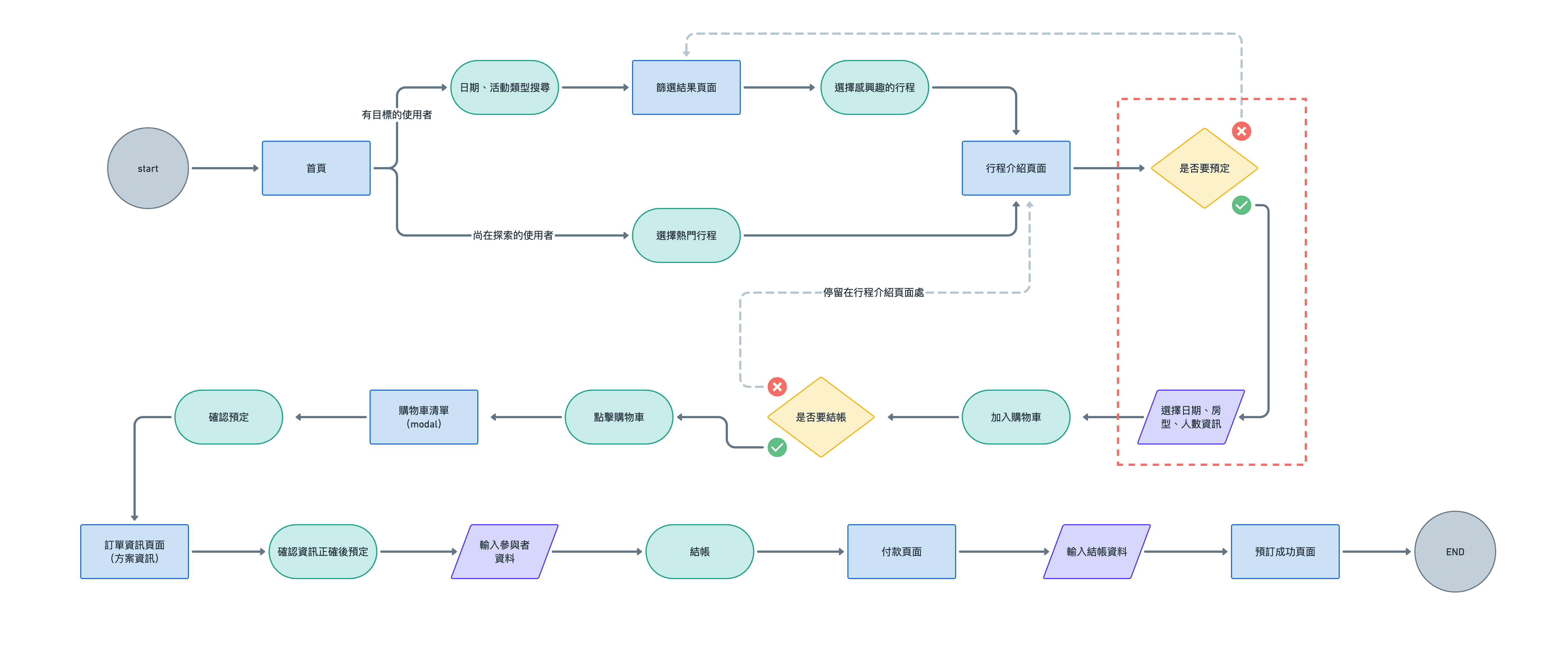
User Flow breaks down the user journey, optimizing key pages within it.
We create flowcharts of the user’s golden journey, where users find their preferred itineraries and complete the purchasing process, and use this to optimize the website's pages. We found that the original website only redirects users to the options selection page for choosing dates, room types, etc., after users decide to book, which may lead to frustration and abandonment of the purchase if they discover that the desired travel time is not available after deciding to buy.
We create flowcharts of the user’s golden journey, where users find their preferred itineraries and complete the purchasing process, and use this to optimize the website's pages. We found that the original website only redirects users to the options selection page for choosing dates, room types, etc., after users decide to book, which may lead to frustration and abandonment of the purchase if they discover that the desired travel time is not available after deciding to buy.
UI interface
Main improvement content:
Based on user feedback on the website, improve UI design such as image buttons, CTA text, enhance the readability of the website, and optimize the presentation of information hierarchy, button hierarchy, search, and filter functions
According to the conclusions from User Flow, merge the selection area into the product introduction page, allowing users to confirm before placing an order that the desired travel time is bookable, avoiding user frustration
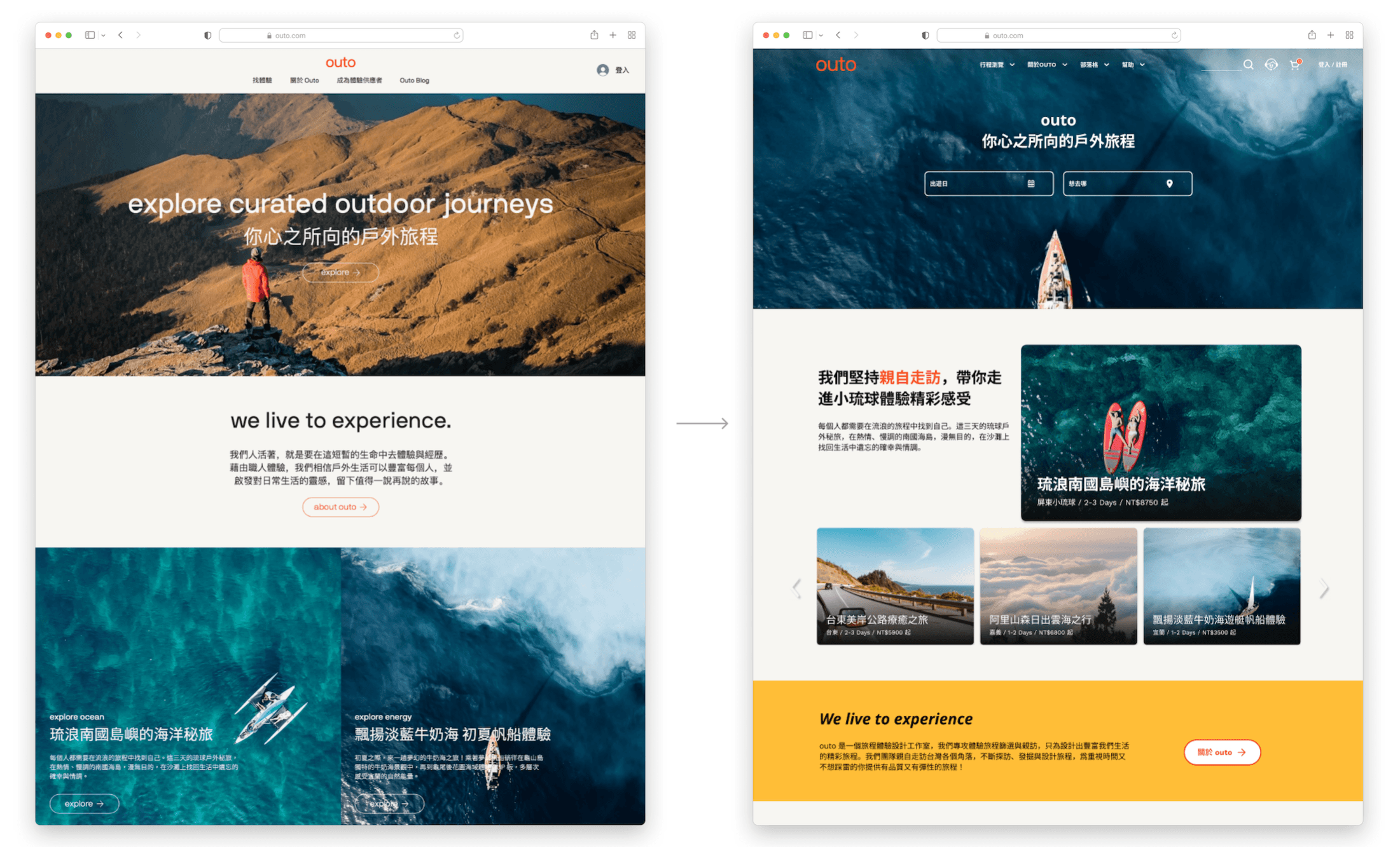
Home
Navigation Bar: Adjust label wording and structure to make it easier for users to navigate the website
Filter: Add filters for date and location, allowing users to quickly find desired itineraries
Featured Itinerary: Improve the UI design of featured itineraries, increasing readability
Navigation Bar: Adjust label wording and structure to make it easier for users to navigate the website
Filter: Add filters for date and location, allowing users to quickly find desired itineraries
Featured Itinerary: Improve the UI design of featured itineraries, increasing readability
The real photo presents the team atmosphere.
Itinerary Introduction Page I
Avoid user frustration: Combine the original website's "Itinerary Introduction Page" and "Experience Booking Page" so that users can confirm that their desired travel dates are available for booking before placing an order
Button optimization: Change the original "Book Plan" button to "Add to Cart" and "Buy Now" to clearly express the actions that will be taken
Add a schedule so that users can quickly get an overview of the itinerary at the top of the page

Itinerary introduction page II
Information Design: Redesigning the display method of itineraries, accommodation, and other information to improve website readability
Sidebar Navigation: Reminding users of the previewed location and content with a distinction between primary and secondary, and adding buttons to guide purchases
Information Design: Redesigning the display method of itineraries, accommodation, and other information to improve website readability
Sidebar Navigation: Reminding users of the previewed location and content with a distinction between primary and secondary, and adding buttons to guide purchases

Feasible next steps
The Outo website is still in its initial construction phase, so during this project period, the team has decided to prioritize "the most urgent and impactful" items, such as optimizing user flow, information design, and interface design. In the future, we can enhance the exploration of user needs and related aspects of purchasing decisions:
The Outo website is still in its initial construction phase, so during this project period, the team has decided to prioritize "the most urgent and impactful" items, such as optimizing user flow, information design, and interface design. In the future, we can enhance the exploration of user needs and related aspects of purchasing decisions:
In user research, we found that security is one of the factors affecting user decisions. In the future, we can explore specific indicators of security for users and add them to the itinerary page.
In user research, we found that security is one of the factors affecting user decisions. In the future, we can explore specific indicators of security for users and add them to the itinerary page.
Most usershope that the itineraries they participate in are of interest to them; however, the current products are all fixed itineraries. In the future, an itinerary replacement module can be evaluated for inclusion on the itinerary page to assist users in creating customized itineraries.
Most usershope that the itineraries they participate in are of interest to them; however, the current products are all fixed itineraries. In the future, an itinerary replacement module can be evaluated for inclusion on the itinerary page to assist users in creating customized itineraries.
Currently, users will directly handle itinerary issues through customer service. However, considering the response time and manpower of customer service, in the future, we can optimize the information on the "Help" page, such as FAQs, to help users solve problems in real time.
Currently, users will directly handle itinerary issues through customer service. However, considering the response time and manpower of customer service, in the future, we can optimize the information on the "Help" page, such as FAQs, to help users solve problems in real time.
Learning and reflection
The Outo website is my first implementation case, and my biggest gain during the process is being able to fully execute the UX Process. I also organized a few directions for future improvement during the process:
The Outo website is my first implementation case, and my biggest gain during the process is being able to fully execute the UX Process. I also organized a few directions for future improvement during the process:
Interview Existing Customers: The respondents in this round have never used the Outo website. By asking users who have previously made purchases about their decision-making factors and their thoughts on the website when placing orders, more detailed insights can be gained.
Increase the Ratio of Quantitative Data: Compared to quantitative data, this project has more qualitative feedback. By increasing the ratio of quantitative data during user research and testing, the reliability of the feedback can be enhanced, making adjustments to the design direction more efficient.
Increase Communication Frequency with Stakeholders: The frequency of meetings for this project is about once a month, primarily for project progress reports. If the frequency can be increased to biweekly meetings, it will allow the overall direction of the project to be more focused and improve execution accuracy.
Check the WCAG Standard in Design: When the team is too focused on brainstorming and design, they may inadvertently overlook design guidelines. By incorporating relevant checks during execution, the quality of the project can be enhanced.
Other projects
Other projects